

These are the notes our team took from Samara Gentle's session at Digiraise '26, so you can feel like you were in the room too.
Samara Gentle asked the room at DigiRaise Sydney who A/B tests their Meta ads. Most hands went up.
Who tests their emails? Most hands stayed up.
Who tests their donation page?
The hands dropped.
“And that’s where modern digital fundraising programs are actually leaking. Not the ads. Not the inboxes. The donation page, where the gift gets made and the next twelve months of the donor relationship gets decided.”
- Samara Gentle, DigiRaise '26
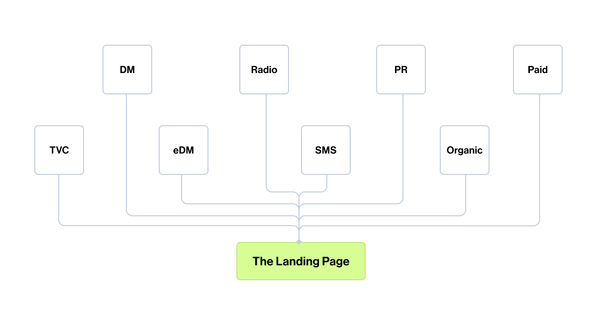
The donation page is doing more work than your reporting shows
Samara opened with two numbers that should hang on every digital fundraiser's wall.
67% of new donors are now acquired online.
And only about one in four of those new donors will give again in their first year
67%
new donors acquired online
1 in 4
return to give in year one
70-90%
first-year donor lapse rate (Sargeant, UK)
Adrian Sargeant's research in the UK puts the lapse rate even higher, between 70% and 90% percent depending on the cohort. Different markets, similar patterns. The donation page is the moment most of that decision gets made. It is where trust either holds or breaks. It is where the data we need to bring someone back either gets captured or gets stripped out.
And it is the surface many of us treat as a one-time build.
Think about where the money actually goes in a tax appeal. Thousands into Meta, thousands into Search. Money into the agency creative, the email production, the influencer push, the QR codes on out-of-home.
Then the donor lands on a page no one tested, that wasn't designed for mobile, and that asks them for less data than the team needs to ever reach them again.
Samara called this gap the shift to strategic fundraising. Strategic fundraising not only focuses on that moment of first donation, but owns the end-to-end lifetime experience of the donor, including the page, the data collected, the journey they go on, and the year after the gift, not just the gift itself.
That framing is the spine of everything that follows. (So keep reading if you want better landing pages!)
The mobile gap that many teams have not actually measured
Samara walked through real conversion data from four anonymous organizations.
One had 90% of its traffic coming from mobile, 7% from desktop, and a mobile conversion rate around 2% against a desktop rate above 13%.
2%
mobile conversion
13%
desktop conversion
The smallest traffic audience was converting at six or seven times the rate of the biggest one.
That is not an edge case. It is a pattern. Mobile traffic has been outpacing desktop for years, but desktop still tends to convert better and produce a higher average gift. The gap is the donation experience, not the donor.
One example she drew on is the nonprofit we all worship for their concept, storytelling, and transparent impact reporting, Charity:water.
Charity:water simply moves the hero image below the donation form on mobile, leading with the copy-based value proposition instead.
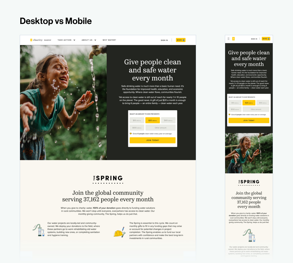
This is one of the easiest mobile donation experience audits you can run.
Open your last appeal page on your phone right now. Scroll once. Decide whether the donor can see why they're here and how to act on it inside that first scroll. If not, that's where the work is.
For Funraisin clients, this is one of the design decisions the Visual Builder is built around. Pages can be composed differently on mobile and desktop from the same site, so the form sits where the donor needs it on each device without a separate build.
A/B testing without the engineering ticket
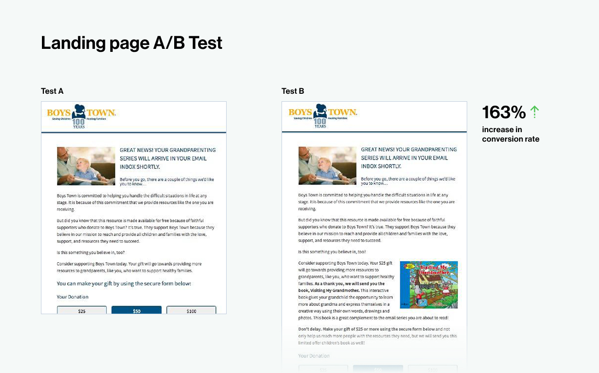
Samara showed three A/B tests that should be required viewing for anyone running tax season.
Boys Town added a (relevant) free guide as a thank-you for new email subscribers and saw a 163% lift in subsequent donations. They also tested a fuller values-aligned email signup landing page against a sparse one and saw a 148% lift on its own.
163%
lift in donations after adding a free guide for new email subscribers
Boys Town
148%
lift from a values-aligned email signup page vs. a sparse one
Boys Town
125%
lift in conversion using preset dollar handles vs. open amount field
CaringBridge
CaringBridge tested an open donation amount field against pre-set dollar handles and the dollar handles lifted conversion by 125%
These aren’t guaranteed improvements to every landing page, but they’re great examples of how nonprofits have tested things with their own audience and their own cause, and implemented what works. These same things may not work for you, but a test will help you get to know your audience better and tailor their donor experience to build deeper and more loyal relationship with your organization.
The argument against A/B testing in most nonprofit teams is that the tools are clunky and the engineering effort is too high. Samara's working answer was just to duplicate your landing page, change one thing, split your traffic from the marketing channel that drives it, and read the result.
That works if your platform makes duplication easy and content changes safe. For Funraisin clients, this is what people are doing when they run multiple variants of the same appeal page side by side and route different audiences to each. No new code, no developer needed, one variable at a time.
Samara recommended picking one thing to test in your next appeal. (Not thirty, even though it's tempting!)
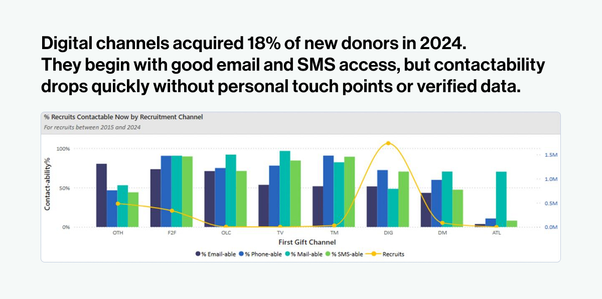
The contactability paradox most digital teams have not had to think about yet
The conventional digital advice for years has been to strip donation forms back to the minimum. Email, name, card. The fewer the fields, the higher the completion rate. That much is true in the moment of the very first donation.
What that advice misses is what happens twelve months later. The Benchmarking Project in Australia tracks donor contactability across channels over time, and email is the fastest-degrading channel by a long way. Open rates and deliverability fall steadily across the first year. If email is the only way you can reach a donor, the relationship has a clock on it.
You cannot retain, upgrade, or convert a donor you cannot reach.
Samara's framing was that donation form best practices need to balance friction against contactability. Cut what is genuinely not needed. Keep what gives the team a chance to come back. Phone where the team actually makes calls. Postal address where impact reports go out. The fields that look like friction in the donation funnel are the fields that produce a second gift six months later
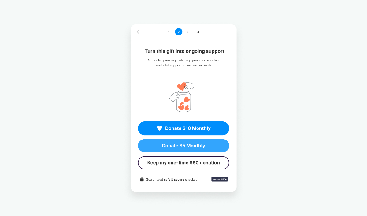
The recurring giving upsell you’ve already got in your toolkit
Samara highlighted the power of that recurring giving upsell prompt that sits between the gift selection and the payment step. The pre-payment regular giving prompt converts at around 2.3% and can double or triple recurring gift volume on a cash appeal. The math is unusually friendly because the donor is already converting.
The retention story makes it even better. Benchmarking Project data shows digitally acquired recurring donors retaining at 70% in their first year, against 47% for face-to-face. The donation page is where that decision gets made. The donor opts-in because they have already chosen to give, not because someone interrupted their afternoon on a footpath.
The Regular Giving Upsell is a feature you can turn on today inside your Funraisin platform, and test. It's an optional step inside the donation form, with dynamic monthly amounts based on the donor's original gift, and full control to continue one-time if they prefer.
Three moves to make before this year's tax appeal goes live
01. Audit your donation page on your phone. Not in a tab. On your actual phone.
Look at where the form sits, what the donor sees on the first scroll, and how many taps it takes to give. Decide what changes first, based on what your traffic mix is telling you.
02. Pick one thing to test in your tax appeal.
Dollar handles versus open amounts is a strong place to start. Duplicate the page, route half your paid traffic to each, and read the result.
03. Have the form fields conversation again, with retention on the table.
Bring the IG manager, the data lead, and the digital lead into one room. Decide what you need to capture to bring this donor back in twelve months, not just what you need to process the gift today. Then ship the form that reflects that decision.
With thanks to Samara Gentle at SG Fundraising for the original DigiRaise session and the field data behind every number in this piece. SG Fundraising works with charities to lift donation page performance and long-term donor value.
Frequently asked questions
What is donation page optimization?
Donation page optimization is the practice of testing and refining the layout, copy, fields, and payment options on a donation page to lift conversion rate and improve long-term donor retention. It treats the page as an acquisition channel in its own right, not just a transaction endpoint.
How do you A/B test a donation page without a developer?
The simplest approach is to duplicate your donation page on your fundraising platform, change one element on the duplicate, and split your paid traffic between the two pages. After enough traffic, you read the conversion results and stick with the winner. This works on most modern fundraising platforms without code.
What fields should a donation form include?
A donation form should include the fields the team genuinely needs to deliver the gift and stay in contact with the donor over the following twelve months. Email is the baseline. Phone matters if the team makes calls. Postal address matters if impact reports go in the mail. Strip what isn't earning its place, keep what supports the second gift.
Why is mobile donation conversion lower than desktop?
Mobile conversion lags desktop on most nonprofit donation pages because the page was usually designed desktop-first, the form sits below other content on small screens, and the payment options often don't include the mobile-native wallets donors expect. The conversion gap is the design choice, not the donor.
Want to walk through what changing the donation experience could look like?
You bring your ambitious goals, and we'll help you bring them to life. We help nonprofits like yours create engaging, personalized donor experiences that last well beyond the moment of donating.
Want to see what's possible? Reach out and let's chat.
