The experiment
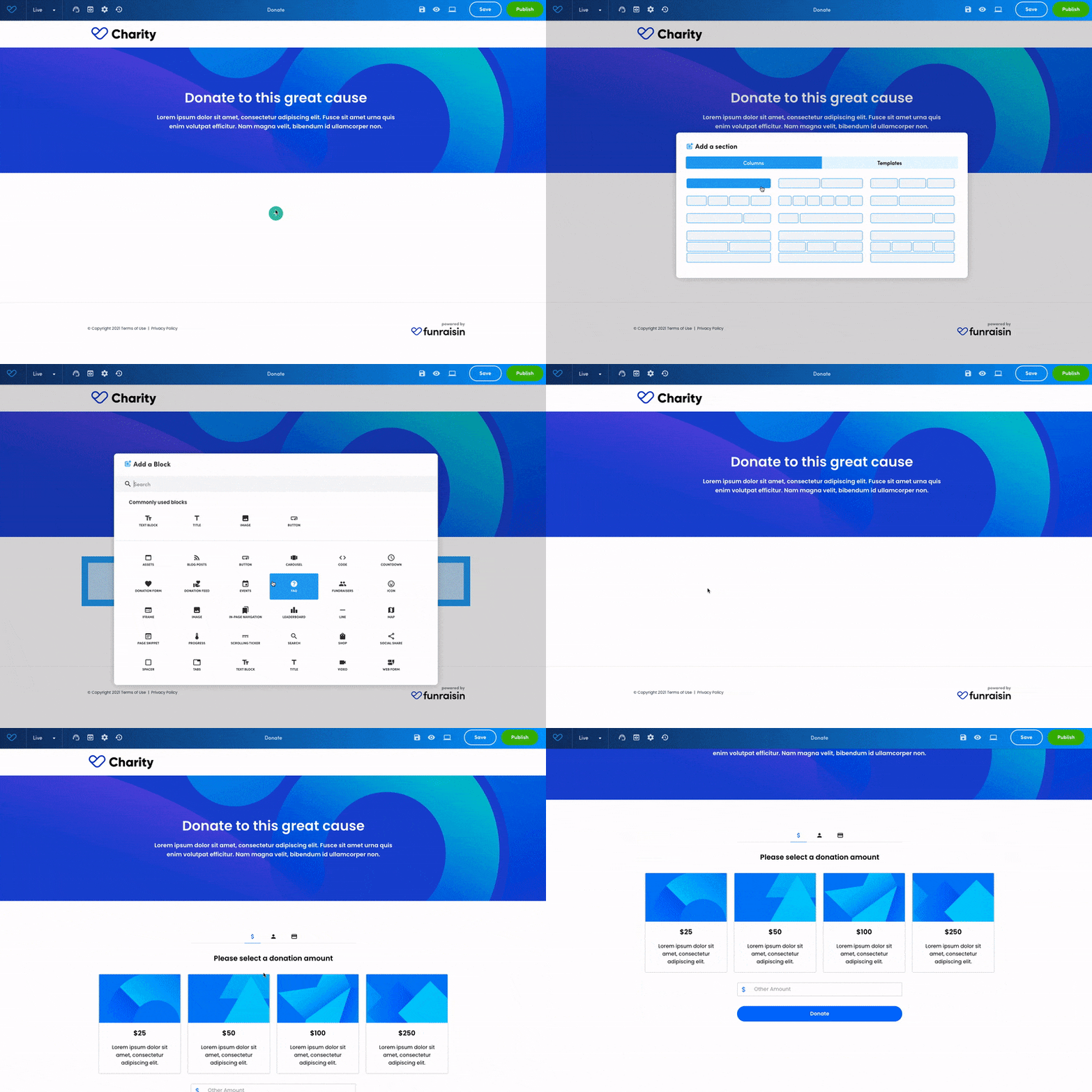
To explore what really motivates donors to give—and give more—we created three distinct donation flows using out-of-the-box Funraisin features. Each version layered on additional elements designed to influence behavior, from basic usability cues to emotional storytelling and urgency triggers.
Tested live with a sample group of 52 UK charity professionals, the experiment aimed to simulate real supporter journeys. Starting with a clean, no-frills form, we progressively introduced features like suggested giving amounts, social proof, matched giving, and a relatable donor persona—allowing us to observe the cumulative effect of each addition on donation value and intent.
Three giving experiences

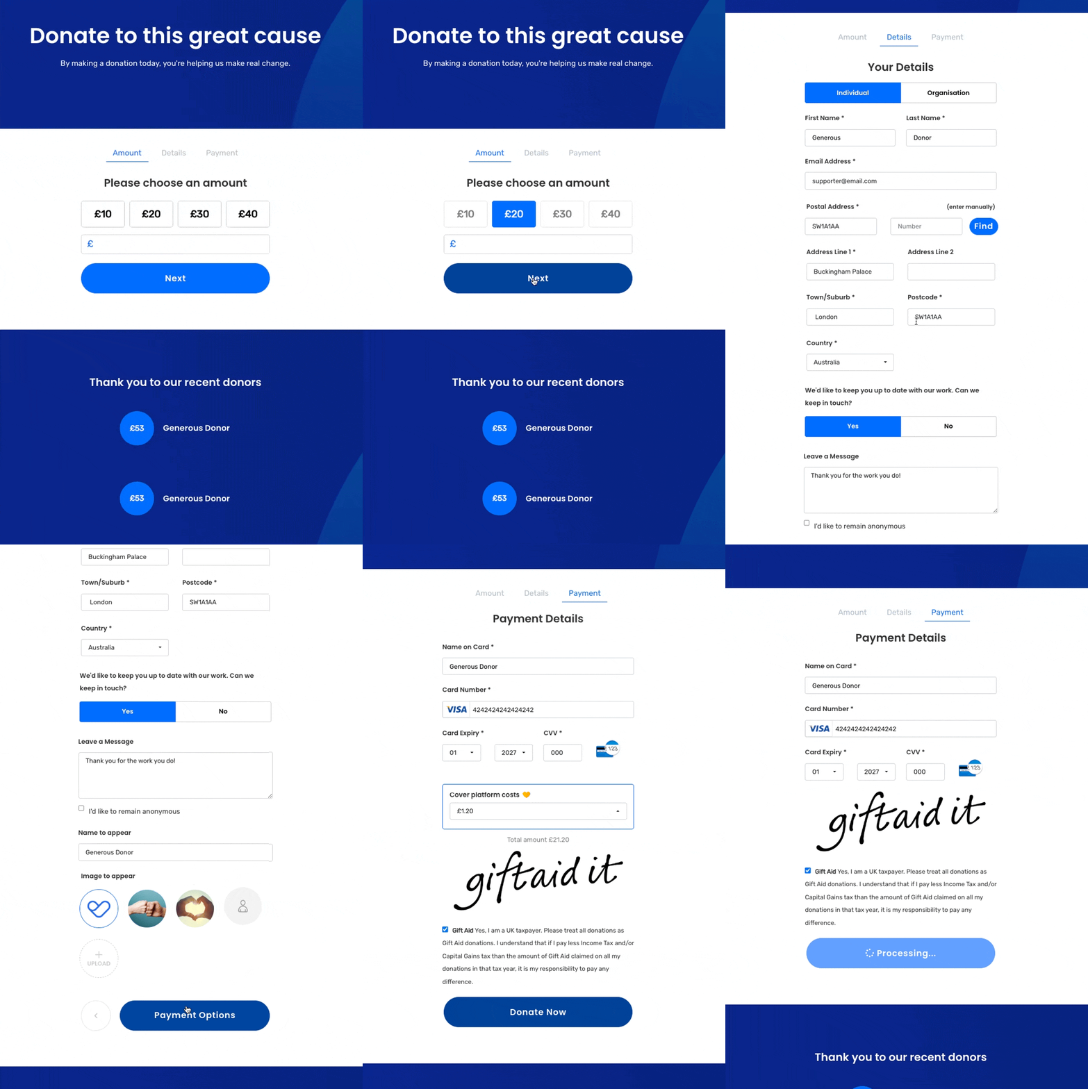
Donation flow #1
A clean, mobile-responsive donation form with a straightforward layout.
Donors enter the amount they wish to give, with no suggested values or guidance.
After providing their name, email, and address, they proceed directly to a standard credit card payment screen.
It’s simple, functional, and easy to use—but lacks any context or emotional cues to inspire giving.
Donation flow #2
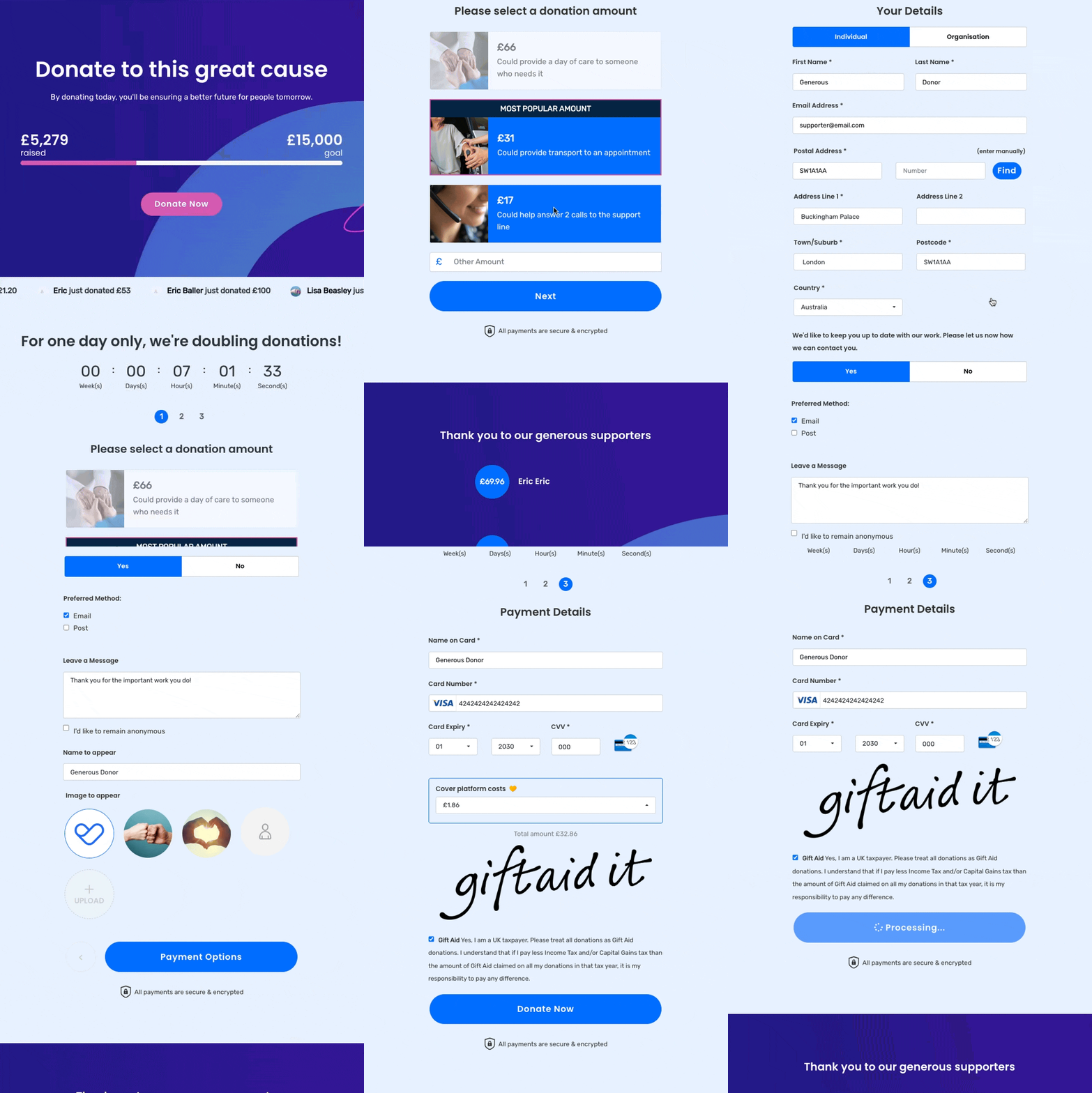
Suggested giving amounts, social proof and space to add a personal message.
This version builds on the basics by introducing suggested donation amounts—helping donors make quicker, more confident choices.
These cues tap into decision-making heuristics, a key principle in user experience design that reduces cognitive load and guides user behavior.
There’s no pre-selected value, and donors can still enter a custom amount if they prefer.
They’re invited to leave a message of support and can personalise their gift with a photo or avatar.
Below the form, a recent donor feed adds a touch of social proof with recent donors and the amounts they gave displayed.
While there’s no detail on how donations help, the suggested giving amounts start to guide the donor’s experience in a more considered way.
Donation flow #3
A persona-driven form packed with cues, context, and impact.
This version puts everything on the table—using a donor persona (‘Eric’) to anchor the experience in real-world empathy and motivation.
Suggested donation amounts are no longer arbitrary—they’re tied to specific impact statements and supported by clear imagery.
One amount is pre-selected and marked as the most popular to guide decision-making.
A matched giving offer, complete with countdown timer and sponsor recognition, adds urgency and amplifies the donor's impact.
The page also includes a live scrolling ticker of recent donors for social proof and a clear campaign goal progress bar.
The Results
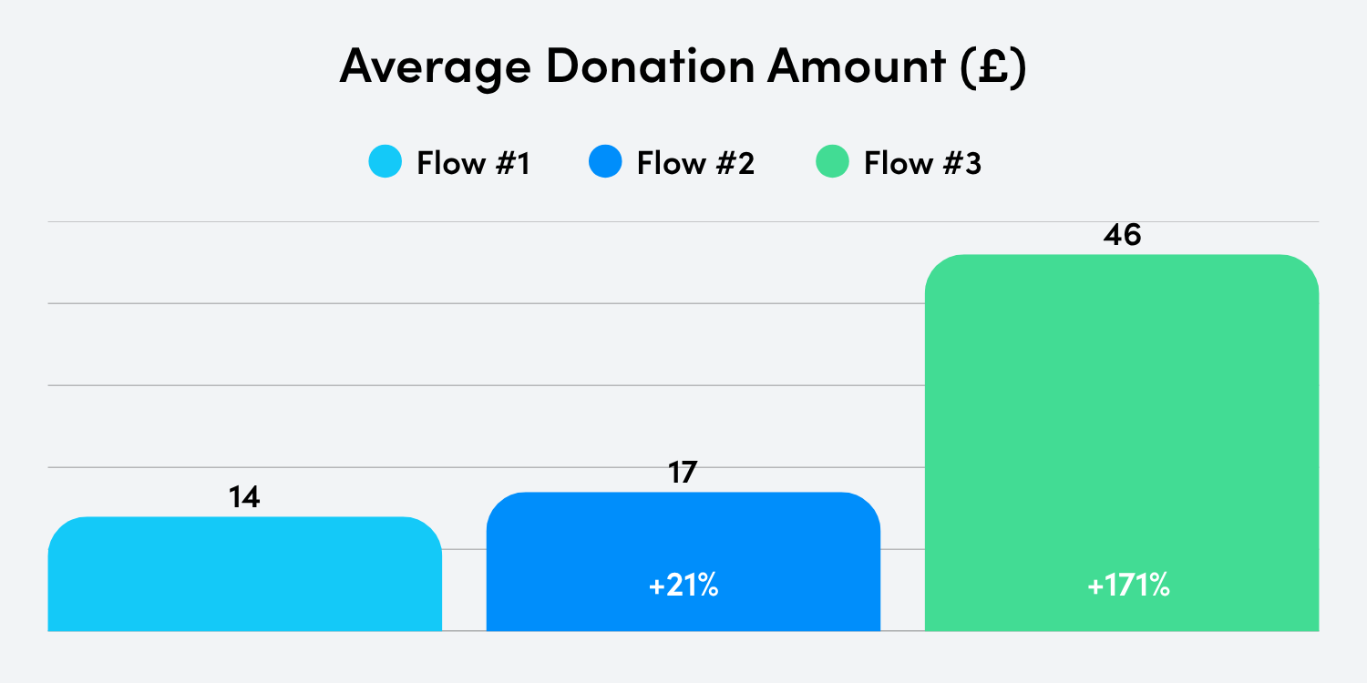
Each donation flow was tested live with a group of 52 UK charity professionals acting as supporters. As we introduced more context, cues, and donor-centred design elements, average donation values increased significantly:
- FLOW #1: A generic donation form with no prompts, no story, and no impact information.
- FLOW #2: Introduced suggested giving amounts, the option to leave a message or upload a photo, and light social proof via a recent donor feed.
- FLOW #3: Anchored around a donor persona (‘Eric’), this version layered in impact visuals, matched giving, a pre-selected popular amount, social proof and a campaign goal.
Designing for Eric
When it comes to designing better donor experiences, testing and iteration are critical—but you need a solid starting point.
That’s where personas come in.
Personas help you step into your supporter’s shoes. They’re not just fictional profiles—they’re tools for empathy, allowing you to design with real motivations, barriers, and behaviors in mind. In UX design, personas are used to shift thinking from “what do we want the user to do?” to “what does the user need to feel confident and motivated to act?”
In Donation Flow #3, we introduced Eric—a 52-year-old professional whose friend had been impacted by the cause.
He’s not a major donor or a serial supporter. He’s someone giving because he cares about someone in his life, and wants to help in a way that feels meaningful.
By shaping the form around Eric, we weren’t just guessing what might work. We used his story to inform donation amounts, choose relevant impact statements, and craft a flow that felt personal and motivating. And it worked: people gave more because they could see themselves in the experience.
Designing for Eric helped us design a more compelling giving experience for everyone.
What made the biggest difference?

Pre-selection nudged behavior.
45% of donors in Flow 3 chose the pre-selected amount. A simple visual highlight removed the guesswork and made it easier to act.

Visuals and context boosted generosity.
The flow built around Eric's persona raised 2.26x more than the basic version. When donors could see the impact of their gift and relate to the story, they gave more—much more.

Adding narrative changed the outcome.
The generic form generated an average gift of just £14. By adding visuals, impact, and suggested amounts, we lifted that to £46—without adding friction.
Donation flow tweaks you can test today.
We built these experiences on Funraisin in just a few hours—no dev team needed. If you’re ready to try something similar, here’s what you can test:
15-minute wins
- Switch donation layout from horizontal to vertical.
- Pre-select your target donation amount.
- Enable the 'full screen donation form on mobile' in your page settings.
1-hour improvements
- Add donation impact handles (“£30 = one night of shelter”).
- Add impact imagery next to donation options.
- Enable a nice 'recent donations' display to add social proof.
Half-day projects
- Develop a donor persona.
- Replace your generic confirmation with a warm, personalised message that reflects the donor’s gift and reinforces their impact.
- Use PURLs in your next email campaign.
New to Funraisin?
Everything you’ve just read was built using our out-of-the-box tools—no dev time, no custom builds. If you're ready to level up your donation experience, book a demo to chat with a platform specialist. We'll show you how to bring it to life.
Already using Funraisin?
You’ve already got the tools—now it’s time to use them. From pre-selected amounts to impact visuals, matched giving and more, these features are ready to test today. Log in, make a tweak, and watch what happens.


